
-26.png)

Think Like a Designer: Elements and Principles of Design in Photography
Updated: Aug 29
The best photography doesn’t happen only in the camera or only in editing software. It starts with a plan.
Note: Some of the links in this post are affiliate links. This means if you click on the link and purchase the item, HiDesine may receive a small commission at no extra cost to you. We only recommend tools we genuinely use and love.
A good photo can fall apart the moment it lands in a layout.
It might be sharp, well lit, and technically “correct,” but if there’s no room for text, the colours fight the design, or the subject faces the wrong way, the image starts working against the message. That’s where a designer’s mindset changes everything.
Thinking like a designer means planning the photo before you pick up the camera. It means asking where the image will live, what shape it needs to fill, what mood it should create, and how editing will support the final piece. That’s the bridge between taking nice photos and building strong visual stories.

Start with the Final Use Before you Start Shooting
Preplanning is the part of photography most people rush. It’s also the part that saves you from awkward crops, mismatched colours, and hours of editing later.
Before a shoot, set one clear goal. Not five. One.
For example:
Show the texture of a handmade ceramic mug
Create a wide website hero image with space for a headline
Capture a portrait that feels calm and editorial
Build product photos for a clean online shop
Create a warm lifestyle image for a seasonal campaign
That goal shapes every choice that follows, including lens, lighting, angle, background, props, and editing style.
This is where Photography in design becomes practical. The photo isn’t just an asset. It’s part of a bigger visual system.
Build a Shot List that Leaves Room for Creativity
A shot list doesn’t kill creativity. It protects it.
When the basics are written down, you’re not trying to remember every detail while adjusting light, directing a subject, or fixing props that keep rolling out of place.
A simple shot list might include:
Wide hero shot with room on the left
Close-up texture detail
Top-down flat lay
Product on plain background
Product in use
Vertical crop for print
Square crop for feed-style publishing
Detail shot with hands, fabric, or natural shadows
Add notes for orientation, mood, colour, background, and the intended crop. If text will sit over the image, mark where it goes. If the photo needs to match an existing website or campaign, pull reference images and colour samples before the shoot.
The best shot lists are specific but not rigid. They give the shoot direction while leaving space for the unexpected image that only appears once the light hits just right.

Match the Aesthetic before Editing Begins
Editing can polish a photo, but it can’t fully rescue a mismatched concept.
A soft, airy layout needs different photography than a dark, dramatic poster. A clean product page needs different backgrounds than a handmade editorial feature. A graphic designer thinks about the whole design before choosing the image treatment, and photographers can borrow that same habit.
Ask these questions before shooting:
Should the image feel natural, polished, playful, quiet, bold, or premium?
Are the colours muted or saturated?
Is the lighting soft or high contrast?
Will the final layout use text, icons, borders, or overlapping shapes?
Does the subject need to feel isolated, or part of a scene?
When the aesthetic is clear early, editing becomes easier. You’re not trying to invent the mood later. You’re refining what’s already there.

Design Layouts by Thinking in Frames
A camera frame is already a layout. Every edge matters.
The subject, empty areas, background shapes, shadows, and crop all guide the viewer’s eye. Designers talk about hierarchy, balance, alignment, and spacing. Photographers use the same ideas, just with light and objects instead of type and shapes.
Purposeful composition starts with asking, “Where do I want the eye to go first?”
Once you know that, you can arrange the frame around it.
Use Negative Space on Purpose
Negative space is not wasted space. It’s breathing room.
In web design, negative space gives text somewhere to sit. In print, it creates elegance and focus. In product photography, it helps the object feel important instead of crowded.
A perfume bottle placed in the bottom third of a vertical frame can feel elegant. A running shoe photographed with clean space in front of it can suggest movement. A portrait with room above the shoulder can give a magazine cover designer space for a title.
The key is intent. Empty space should feel chosen, not accidental.
Watch the Edges of the Frame
Strong composition often comes down to edge control.
Before you take the photo, scan the borders. Are there distracting objects half-cut off? Is a prop touching the edge in an awkward way? Is the subject too close to the crop line? Are lines in the background tilting for no reason?
Small fixes during the shoot can save major editing time later.
A useful habit is to take one photo, pause, and review only the composition. Ignore colour and exposure for a moment. Look at shape, balance, spacing, and the relationship between the subject and the frame.

Let Colour Lead the Mood
Colour affects how an image feels before anyone notices the details.
Warm tones, like amber, cream, red, and orange, often feel inviting, nostalgic, energetic, or intimate. Cool tones, like blue, slate, green, and violet, can feel calm, clean, distant, or refined.
Neither is better. They simply tell different stories.
A warm food photo can make a dish feel comforting. A cool-toned skin care product image can suggest freshness. A dark green and gold product scene can feel rich and grounded. A pale blue background with soft shadows can feel simple and quiet.
Balance Light and Dark Areas
Designers think in contrast because contrast creates hierarchy. Photography works the same way.
A bright subject on a dark background pulls attention fast. A dark product on a pale surface can feel crisp and graphic. Low-contrast images feel softer and more atmospheric, while high-contrast images feel sharper and more dramatic.
This matters when photos carry text. If a headline sits over the image, the background needs enough contrast to keep the words readable. Many layout tools use overlays for this reason, often adding a subtle dark or light layer between image and text.
The Web Content Accessibility Guidelines, known as WCAG, are often used for digital readability standards. While they focus on text and interface contrast, the same idea helps with photo layouts. If people can’t read what sits on the image, the design isn’t working.
Use Elements and Principles of Design in Photography to Connect the Set
Colour grading is where separate images start to feel like a family.
Basic colour grading can include:
Adjusting white balance so whites feel neutral or intentionally warm
Slightly lifting shadows for a softer look
Deepening blacks for a more dramatic look
Reducing saturation for a calm editorial feel
Shifting greens, blues, or yellows so they match the project palette
Applying a consistent curve across the full photo set
Be careful with presets. They’re useful starting points, but they can flatten every shoot into the same mood. Skin tones, product colours, and material textures still need to look believable.
If you photograph clothing, cosmetics, packaging, artwork, or food, colour accuracy matters. Viewers expect the object to match reality closely. Creative grading should support the image, not misrepresent the product.
Treat Product Photography like a Design System
Product photography has one main job: make the object clear, appealing, and easy to understand.
That sounds simple, but backgrounds, props, angles, and shadows can either help or distract. A designer’s mindset keeps the product at the centre.
Remove backgrounds when clarity matters
Background removal is useful when an image needs flexibility. A cut-out product can sit on a website, catalogue, poster, comparison chart, or clean product grid without clashing with the layout.
It also helps when:
The original background looks messy
Product edges need to be clean
Multiple products need a consistent look
The image will appear on light and dark layouts
Shadows need to be rebuilt for a more polished finish
Clean background removal works best when the original photo is sharp and well lit. Shoot with separation between the product and background. Avoid placing dark objects on dark surfaces or transparent objects against busy textures.
The cleaner the source image, the better the edit.
Use flat lays when shape and styling matter
Flat lays are great for products that benefit from context. Books, tools, food, accessories, art supplies, and small packaged goods often look good from above.
The trick is to build structure into the scene. Align objects to an invisible grid. Repeat shapes. Leave some gaps. Choose props that support the product instead of stealing attention.
A skincare bottle beside eucalyptus, a towel, and a stone dish tells a different story than the same bottle beside neon paper and hard flash. Both could work, but not for the same design goal.
Stage Scenes when you Need a Story
Staged product photography gives the viewer a sense of use.
A mug beside a book and morning light feels different from a mug floating on white. A pair of hiking boots on gravel tells a different story than boots on a seamless studio background.
When staging, choose one clear idea. Don’t add props just because the scene feels empty. Each object should help explain scale, use, mood, or material.

Pick the Right Camera for Your Budget
Good design thinking matters more than expensive gear, but the right camera can make the work easier. Better autofocus, cleaner low-light files, stronger video features, and interchangeable lenses all give you more control.
Prices vary by retailer, bundles, sales, and whether the camera is new or used, but these budget points are useful for planning.
Camera | Price Estimate | Best fit | Where to Buy |
Canon EOS Rebel T7 | $400 | Beginners who want a simple DSLR for portraits, products, and everyday shoots | |
Nikon D3500 | $500 | New photographers who want strong battery life, good image quality, and easy controls | |
Sony ZV-1 | $750 | Creators who need a compact camera for stills and video without changing lenses | |
Fujifilm X-T30 II | $1,000 | Photographers who want a small mirrorless body, strong colours, and manual control | |
Sony A7 III | $2,000 | Advanced shooters who want full-frame quality, strong autofocus, and excellent low-light files |
The Canon EOS Rebel T7 and Nikon D3500 are practical starter cameras. They’re not the newest bodies, but they’re approachable and capable when paired with good light.
The Sony ZV-1 is a smart choice if you want something compact. Its fixed lens means less flexibility, but also less gear to manage.
The Fujifilm X-T30 II gives you more creative control in a small body. Fujifilm is known for pleasing colour profiles, which can help when you want a strong look straight out of camera.
The Sony A7 III is the most expensive option here, but it’s popular for a reason. Full-frame sensors can give better low-light performance and more background blur when paired with the right lens.
If your budget is tight, spend some money on lighting and backgrounds before chasing the most expensive camera. A basic camera with soft window light and a clean setup can beat a pricey camera in a messy room.
Compose for the Format Before you Crop
Cropping after the shoot is normal. Relying on cropping to fix everything is risky.
Different formats need different composition choices. If an image has to work across web, print, and square crops, shoot with extra room around the subject.
Landscape Works Well for Websites
Landscape, or horizontal, images are common for website banners, blog headers, product hero sections, and wide editorial layouts.
For horizontal frames:
Keep the main subject slightly off centre when text needs space
Leave clean areas on one side for overlays
Watch for distracting background lines
Shoot wider than needed for responsive layouts
Website images often resize across desktop, tablet, and mobile. That means the edges may disappear on smaller screens. Keep the most important content near the safe centre area.
Portrait Suits Print and Vertical Storytelling
Portrait, or vertical, images work well for posters, magazine-style pages, lookbooks, product cards, and mobile-first layouts.
Vertical frames can feel more intimate because they give height to the subject. They also work well for full-body fashion, tall products, architecture details, and editorial portraits.
Leave room above and below the subject if text, page numbers, or design elements will be added later.
Square Cropping needs Balance
Square images are tricky because they force balance. There’s no wide side or tall side to lean on.
For square compositions:
Centre the subject when symmetry helps
Use diagonals to create movement
Place small objects in groups of three or five
Keep backgrounds simple
Use shadow direction to add depth
Square formats are common in feed-style visual grids, thumbnails, and product galleries. A square crop should feel intentional, not like a chopped-down horizontal photo.
Add Extra Safety for Banners, Covers, and Thumbnails
Some formats are unforgiving. Very wide banners can crop the top and bottom heavily. Book covers and posters may need large title areas. Thumbnails need bold shapes that stay readable when tiny.
A good habit is to shoot each setup in three versions:
Tight crop for detail
Medium crop for general use
Wide crop with negative space
That gives the final design more options.
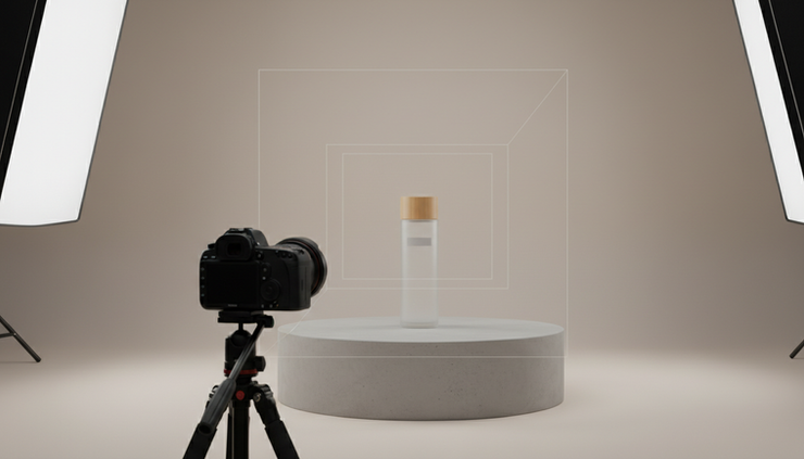
Edit with Restraint and Purpose
Editing should make the photo more useful, not just more dramatic.
Start with the basics:
Straighten lines
Fix exposure
Set white balance
Clean dust or small distractions
Adjust contrast
Crop for the final format
Match colour across the set
Then ask one design question: does the edit support the story?
A gritty black-and-white edit might suit a documentary-style portrait. It probably won’t help a soft baby blanket product photo. A high-saturation food image can feel appetizing, but pushing skin tones too far can look strange.
Editing is also where consistency matters. If five photos appear on the same page, they should feel related. The light, contrast, colour temperature, and crop style don’t need to be identical, but they should feel like they belong together.
The Next Layer is Texture, Pattern, and Colour
Once composition and colour start to click, the next big step is learning how texture and pattern shape an image.
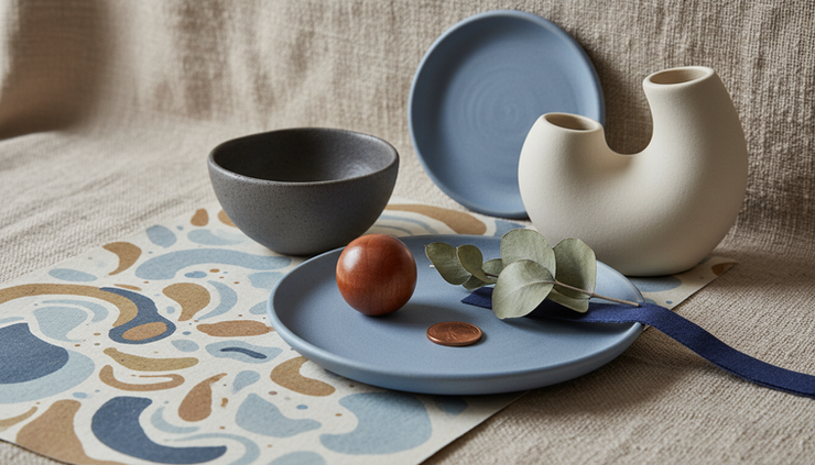
Texture adds feeling. Rough stone, soft linen, glossy glass, matte paper, brushed metal, and fresh fruit all change the mood of a photo. Pattern adds rhythm. Repeating tiles, shadows, fabric folds, grids, leaves, and packaging rows can guide the eye through the frame.
Colour ties it all together.
That’s where visual storytelling gets richer. A clean photo can show what something looks like. A well-designed photo can show how it feels.
If you want help shaping stronger visuals for your next project, explore creative photography and design services.
Think Before You Shoot, Then Edit with Intention
The best photography doesn’t happen only in the camera or only in editing software. It starts with a plan. Use the elements and principles of design in photography in the preparation and process to unify the photo to the design.
Set the goal. Build the shot list. Match the aesthetic. Compose for the layout. Use colour with purpose. Choose backgrounds that help the subject. Shoot for the formats the image needs to fill.
That’s the designer’s mindset. It turns photography from a single image into a complete visual story.
To display the Widget on your site, open Blogs Products Upsell Settings Panel, then open the Dashboard & add Products to your Blog Posts. Within the Editor you will only see a preview of the Widget, the associated Products for this Post will display on your Live Site.
Start your 14 days Free Trial to activate products for more than one post.
icon above or open Settings panel.
Please click on the


Comments