
-26.png)

Mastering Elements of Texture, Pattern, and Colour in Photography and Editing
Great photography doesn’t come from adding more to the frame. It comes from making clearer choices.
Note: Some of the links in this post are affiliate links. This means if you click on the link and purchase the item, HiDesine may receive a small commission at no extra cost to you. We only recommend tools we genuinely use and love.
A photo can be sharp, well lit, and still feel flat. That’s the frustrating part. The product is clear, the scene is clean, the camera did its job, but the image doesn’t hold attention.
That’s where texture, pattern, and colour do a lot of quiet work.
Texture makes people imagine touch. Pattern gives the eye a path to follow. Colour sets the mood before anyone reads a single word. Put them together well, and a simple photo of a candle, pastry, handmade mug, skincare bottle, or retail display can feel polished and memorable.
This is the heart of Mastering Photography Elements. You’re not just making things look nice. You’re guiding attention, creating feeling, and giving each image a clear reason to exist.
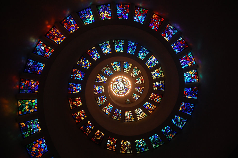
Texture Gives Your Photos a Sense of Touch
Texture is one of the fastest ways to make an image feel real. Smooth glass, rough wood, wrinkled linen, cracked paint, frosted metal, brushed paper, and stone all add information to a photo.
In product and brand photography, texture helps answer questions without words. Is this item handmade? Soft? Premium? Natural? Rugged? Clean? The viewer picks up clues from the surfaces around the subject.
A bar of soap on a glossy plastic tray feels different from the same soap on slate, cotton, or unfinished wood. The product hasn’t changed. The story has.
Add texture before you take the shot
The strongest texture work usually starts on set, not in editing. Look at what your subject is sitting on, leaning against, or surrounded by.
Try simple surface swaps:
Linen instead of plain white paper for a softer, handmade feel
Concrete or stone for skincare, candles, or home goods with a minimal style
Wood grain for food, coffee, pottery, and artisan products
Glossy tile or acrylic for a clean, modern look
Crumpled kraft paper for packaging and natural products
Keep the texture connected to the product. A delicate necklace on rough gravel might be interesting, but it can also feel random. A linen backdrop, velvet box, or brushed tray may support the piece better.

Capture texture directly with light
Texture needs shadow. If the light hits a textured surface straight on, the surface can look flat. Move the light to the side, and those tiny ridges, dents, and fibres appear.
A simple side-lit setup can make a big difference:
Place your subject near a window.
Turn it so the light falls across the surface, not directly at it.
Use a white card on the opposite side if the shadow is too dark.
Take one close shot and one wider shot to compare the feel.
This works beautifully with baked goods, fabrics, ceramics, paper goods, leather, and natural skincare products.
Use texture overlays with care
Texture overlays can help when an image feels too clean or digital. In editing software, an overlay is usually a separate image layer, such as film grain, paper fibre, dust, scratches, or fabric, blended into the photo.
The trick is restraint. If people notice the overlay before they notice the subject, it’s too strong.
Good uses for overlays include:
Adding subtle paper grain to a campaign image
Giving a seasonal photo a warmer, handmade feel
Matching a new photo to an older set of images
Softening large empty areas in a background
Set the overlay layer to a blending mode like `Soft Light`, `Overlay`, or `Multiply`, then lower the opacity. Mask it away from faces, labels, fine product details, and anything that needs to stay crisp.
Pattern Helps the Eye Know Where to Go
Pattern is repetition. It can be obvious, like tiles, stripes, shelves, or rows of pastries. It can also be subtle, like repeated leaf shapes, window shadows, packaging lines, or the curve of stacked bowls.
Humans are naturally good at spotting repetition. Gestalt design principles, which have influenced visual design for more than a century, explain how people group similar shapes and repeated forms. In plain language, when the eye sees a pattern, it looks for order.
That’s useful in photography because order makes an image easier to read.

Use patterns already in the environment
You don’t always need props. Look around for patterns that already exist.
You might find them in:
Floor tiles
Brick walls
Market crates
Window blinds
Café tables
Woven baskets
Shelving
Stair rails
Garden rows
Packaging stacks

If you’re photographing a food product, a tiled counter may give structure. If you’re shooting handmade goods, a woven blanket might create a soft repeating background. If you run a retail display, neat rows can make the products feel abundant and organized.
The key is to make sure the pattern supports the subject rather than competing with it. If the background is busier than the product, simplify.
Create repeating patterns on purpose
You can build patterns yourself with multiples of the same item.
For example:
Line up three candles at slightly different heights.
Arrange cookies in a circle around one broken cookie.
Place skincare bottles in a clean diagonal row.
Repeat napkins, plates, or tools around a hero product.
Use slices of citrus, flowers, beans, or leaves as repeating accents.
Odd numbers often feel natural in compositions, especially groups of 3 or 5. Even rows feel more structured and polished. Neither is better. They just create different moods.
If you want the photo to feel relaxed, break the pattern a little. Turn one object slightly. Remove one piece. Add one imperfect detail. That small interruption gives the eye somewhere to stop.
Use patterns as frames
A pattern can also frame your subject. Think of leaves around a bottle, tiles around a plate, or stacked books around a handmade journal.
Framing works because it points attention inward. It says, “Look here.”
Try using pattern frames when the product is small or simple. Jewellery, stationery, cosmetics, ceramics, and packaged foods often benefit from a frame because the surrounding repetition gives the subject more presence.
Colour Sets the Mood Before the Details Land
Colour does emotional work fast. Warm tones can feel friendly, rich, cosy, or energetic. Cool tones can feel calm, clean, fresh, or refined. High contrast feels bold. Low contrast feels gentle.
There’s also a practical side. Colour affects readability. If a product label, food item, or key detail blends into the background, the photo won’t work as well, no matter how pretty it is.
Here’s a helpful way to think about colour in a shoot:
Colour choice | What it tends to create | Example |
Similar colours | Calm and polished | Beige ceramic on linen with dried grasses |
Complementary colours | Strong contrast and energy | Orange drink against blue tile |
One bright accent | Clear focus | Red berry on a neutral dessert |
Muted palette | Soft and natural | Cream, sage, clay, and warm grey |
Bold palette | Playful and confident | Pink, yellow, green, and cobalt |

Colour theory can get deep, but you don’t need a design degree to use it well. Start with one clear choice. Decide on the mood first, then pick colours that match.
Use colour to guide attention
Ask yourself one question before editing: where should the eye go first?
If the answer is the product, make sure it has the strongest colour contrast, brightness contrast, or saturation in the frame. If the brightest object is a prop in the corner, the viewer may look there instead.
You can guide attention by:
Placing a warm subject on a cool background
Keeping props less saturated than the main subject
Using a bright accent near the focal point
Darkening background edges slightly
Removing distracting colour casts
This is especially helpful for online shops and service websites, where images need to communicate quickly.
Try colour grading for mood
Colour grading is the creative colour treatment applied after basic correction. It’s common in films, commercial photography, and editorial work.
Basic correction comes first. Fix exposure, white balance, contrast, and skin or product accuracy. Then grade for style.
For example, you might:
Warm up highlights for a cosy bakery image
Cool down shadows for a clean skincare look
Lower saturation for a calm, earthy product set
Add a soft green tint to shadows for a natural feel
Push blues and oranges for stronger contrast
Keep product truth in mind. If the item is a cream-coloured sweater, don’t edit it until it looks yellow. If a sauce is deep red, don’t make it orange just because the grade looks trendy. The image still needs to represent the real thing.
Use filters as a starting point, not the final look
Presets and filters can save time, but they aren’t magic. The same filter can look great on one image and strange on another because every photo starts with different light, colours, and exposure.
Use filters lightly, then adjust:
Exposure
White balance
Highlights and shadows
Saturation
Skin tones or product tones
Grain
Contrast
A good rule: apply the filter, reduce its strength, then make small manual fixes. That keeps the image from looking overprocessed.

How Combining Photography Elements of Texture, Pattern, and Colour Makes Images Feel Intentional
The real skill comes from using texture, pattern, and colour together without making the image feel crowded.
A textured linen backdrop, a repeating row of products, and a warm colour grade can work beautifully. But if the fabric is too rough, the pattern is too busy, and the colours are too saturated, the subject gets lost.
Think of the three elements as volume controls. You don’t need all of them turned up at once.
Choose one lead element
Before you shoot or edit, decide which element matters most.
If texture is the lead, use simple colour and a calm composition. For example, a close photo of handmade pottery on linen doesn’t need loud props.
If pattern is the lead, reduce texture and colour noise. A neat grid of pastries looks stronger when the background stays simple.
If colour is the lead, let texture and pattern support it quietly. A bright red drink against pale blue tile already has impact. Extra props may weaken it.
This one decision makes editing easier because you know what to protect.
Layer elements in a natural order
When building a photo, try this order:
Pick the subject.
Choose the surface texture.
Add or find a pattern.
Set the colour palette.
Light the scene.
Edit for clarity and mood.
That order helps avoid random styling. It also makes the final image feel like it belongs to the same visual family as your other photos.
For a simple example, imagine a handmade candle.
A calm version might use:
Stone surface
Linen background
Repeated dried flowers
Cream, tan, and soft brown tones
Warm side lighting
Low contrast editing

A bolder version might use:
Glossy tile
Repeating matchsticks
Deep red and pale pink accents
Stronger shadows
Higher contrast editing
Same product, different feeling.
Keep your visual style consistent
Consistency matters when photos appear together on a website, online shop, menu, portfolio, or printed material. One great photo helps. A consistent set builds recognition.
You don’t need every image to look identical. You need shared choices.
Pick a few rules, such as:
A core colour palette
Two or three favourite surfaces
A preferred lighting style
Similar crop ratios
A consistent level of contrast
A repeatable editing preset, adjusted by hand each time
This is where texture, pattern, colour, editing choices become part of a recognizable style. When those choices repeat, people start to connect the look with the product or service.
Editing Should Make the Story Clearer
Editing isn’t just about fixing mistakes. It’s where you refine what the photo is already saying.
Start with a clean base edit:
Straighten the image.
Crop out distractions.
Correct white balance.
Set exposure.
Adjust highlights and shadows.
Check that the subject still looks true to life.
Then move into creative edits.
For texture, add a little clarity or local contrast where you want detail. Avoid applying sharpness everywhere, especially to smooth backgrounds.
For pattern, crop carefully. A pattern that’s slightly crooked can feel messy. Use guides if your software has them.
For colour, work with HSL controls if available. HSL stands for hue, saturation, and luminance. It lets you adjust specific colour ranges instead of changing the whole image. That means you can soften greens in the background without dulling the warm colour of a product.
A simple editing checklist can save a lot of second-guessing:
Editing question | Why it matters |
What should stand out first? | Keeps the image focused |
Is any texture distracting? | Prevents visual clutter |
Does the pattern help or compete? | Protects the subject |
Do the colours match the mood? | Creates a clearer message |
Does the product still look accurate? | Builds trust |
If an edit doesn’t help the image communicate, pull it back.

Practice with Small Creative Exercises
The best way to get better is to run small tests. Don’t wait for a major shoot. Set aside 30 minutes and photograph one object three ways.
Try these exercises:
Texture study
Photograph the same product on three surfaces. Use wood, fabric, and stone. Keep the light and camera angle the same. Compare how the mood changes.
Pattern study
Create three compositions using repetition. Try a straight row, a circle, and a diagonal line. Notice which one feels most natural for the subject.
Colour study
Choose one product and build three palettes around it. Use neutral, complementary, and monochrome colour choices. Edit each set lightly and compare the results.
Take one strong photo and make three versions. Keep one natural, make one warm and cosy, and make one cool and minimal. This teaches you how colour grading changes emotion.
Save the results side by side. Over time, you’ll build your own reference library, which is more useful than guessing during every shoot.
When You're on the Go
Sometimes, you're on the go and you need a little reminder for how to handle your camera for settings, modes, or composition tips. We found a great little book called Photography 101: Pocket Guide - Settings, Modes, Composition Tips, and Shooting Scenarios by Rocky Nook. You can flip through it in minutes
You can find this book on Amazon and it's just small enough (3.5" x 5.25") to fit in a book bag, camera bag, or large pocket when you're on the go with your camera in hand. Check it out!

FAQ
How do I use texture without making a photo look messy?
Use one main texture and keep the rest simple. If the surface is rough or detailed, choose plain props and a clean background. Let the subject stay the focus.
What’s the easiest pattern to use in product photography?
Rows are the easiest place to start. Line up products, ingredients, tools, or props in a simple direction. Diagonal rows add movement, while straight rows feel neat and calm.
Should I edit colours to match my brand palette?
Yes, but don’t force it. Use your palette in backgrounds, props, and accents first. Editing can refine the look, but the product should still look accurate.
Are filters bad for small business photos?
No. Filters can help create consistency, especially when you’re editing many images. Just reduce the strength and adjust each photo by hand so the results don’t look copied and pasted.
What matters most, texture, pattern, or colour?
Colour usually creates the fastest emotional reaction, but texture and pattern add depth and structure. Pick one lead element for each photo, then use the others to support it.

Build a Stronger Visual Style One Photo at a Time
Great photography doesn’t come from adding more to the frame. It comes from making clearer choices.
Choose texture when you want people to feel the surface. Use pattern when you want order, rhythm, or movement. Shape the colour when you want to set a mood fast. When all three work together, your photos feel more thoughtful, more memorable, and easier to recognize.
If you’d like help creating polished photo and editing work for your own visuals, take a look at Hidesine’s creative services. Start with one image, make one stronger choice, and build from there.
To display the Widget on your site, open Blogs Products Upsell Settings Panel, then open the Dashboard & add Products to your Blog Posts. Within the Editor you will only see a preview of the Widget, the associated Products for this Post will display on your Live Site.
Start your 14 days Free Trial to activate products for more than one post.
icon above or open Settings panel.
Please click on the


Comments